Lily Café
Taipei
Commercial interiors succeed or fail at the brand question: does the space say what the business needs to say, or does it just decorate around a concept? At Lily Crêpe Café, the answer is in the architecture before you open the door.
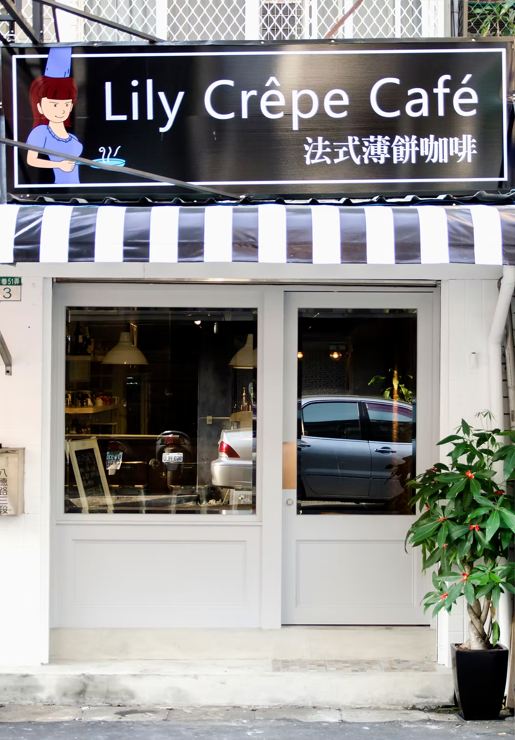
The storefront announces it clearly: navy and white awning stripes, white-painted boiserie panels below the glazing, a black sign with the brand’s illustrated mascot — a girl in a chef’s toque with a crêpe pan. Classic, legible, French-referencing without being costume. Through the glass, pendant lights glow warm against a white tile wall, and you already know what kind of place this is going to be.
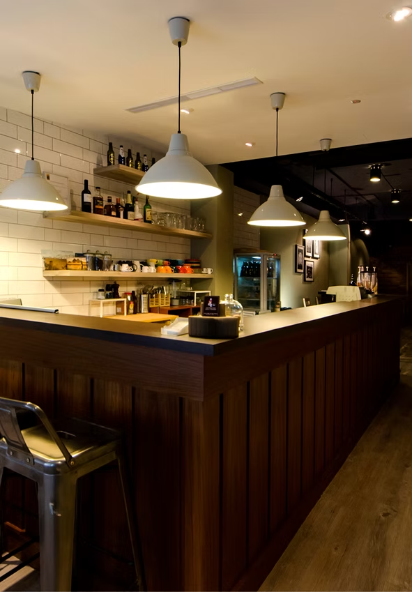
Inside, the design operates as two rooms in one. The service counter — dark walnut beadboard front, white subway tile behind, white enamel dome pendants hanging at staggered heights — is the bright, active heart of the space. A Tolix stool at the counter’s edge is a deliberate choice: an icon of French industrial design, manufactured in Burgundy since 1927, doing exactly the work it was made to do. Floating shelves hold an unruly collection of ceramic cups, glassware, and bottles — the kind of display that reads as genuinely accumulated rather than sourced in an afternoon.
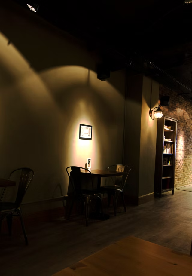
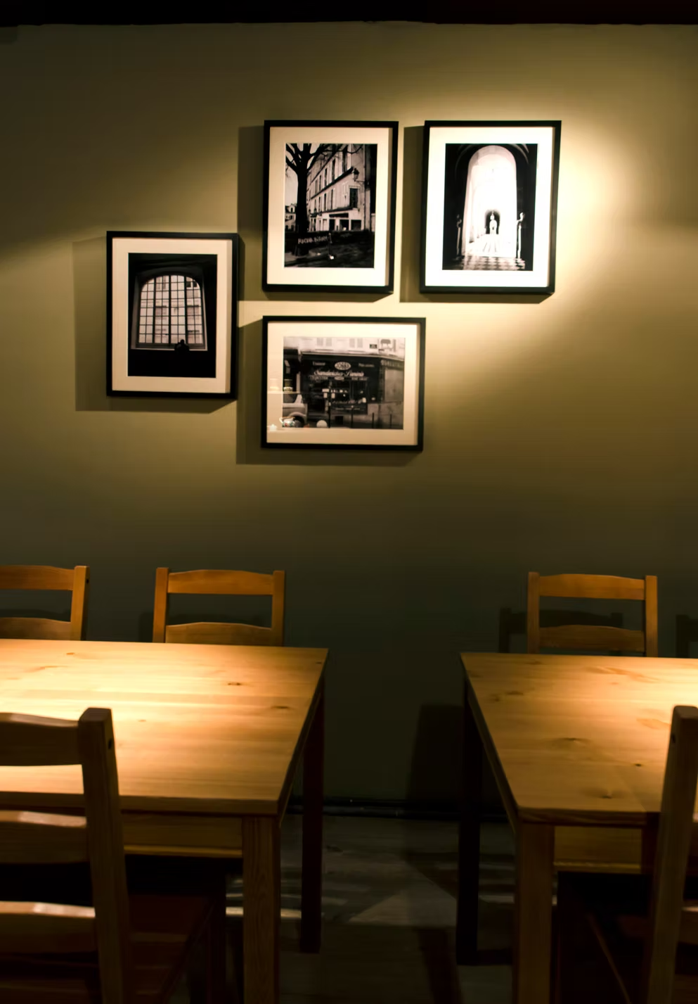
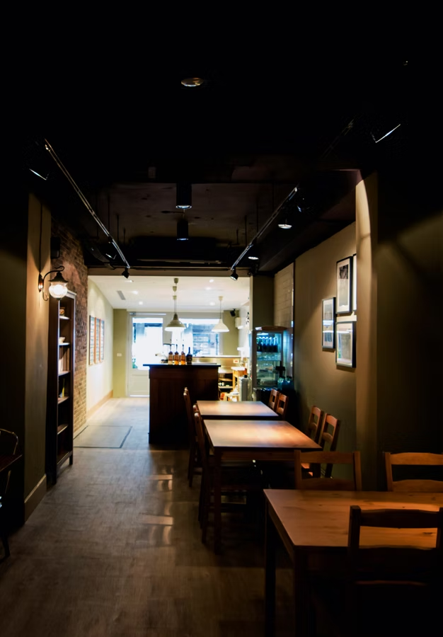
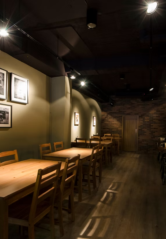
Walk deeper into the dining room and the mood shifts completely. The ceiling goes black — exposed ductwork, conduit, and track rails all unified by matte paint, ceiling height reclaimed without concealment. The walls are sage-olive, matte, absorbing. Focused track spots arc warm light against the surfaces, each table lit like a stage set. Exposed brick on one wall. A tall dark bookshelf in the corner. Black-and-white photographs of Paris — an arched window, a vaulted arcade, a rain-lit crêperie at night — hung in salon clusters and each spotlit individually.
The spatial argument is simple and effective: the crêpe counter is a Parisian kitchen, bright and alive; the dining room is a Left Bank cave, dark and made for staying. Between them, the experience of the whole.